The forms on your website can make or break your success as a business owner.
If instructions aren’t clear or the user isn’t told how to fix an error, chances are they will leave your site. And then there’s accessibility. It’s another layer of form design that cannot be overlooked any longer.
Imagine if you were one of the approximate 20% of the population with a disability that prevented you from filling out a simple form on a website. What would you do?
I’m guessing you’d try once more and then move on to another site that makes it easy for you. And that’s not good for anyone.
This post will summarize what you can do now to make your website forms more accessible through the use of labels, placeholders, clear instructions, fixing user errors, colour contrast and the use of required (*) marks.
Accessible Forms Are Key to Website Visitors
An accessible form is not only easy to fill out, understand, and submit but also clearly identifies instructions, cues, required fields, and field formatting requirements for disabled users.
They may look the same or similar to other forms on the web but there are some distinct differences that you can see. And of course, there are some differences, like whether a user can navigate a form with a mouse only, or embedded in the code, that you can’t see unless you use the browser inspector.
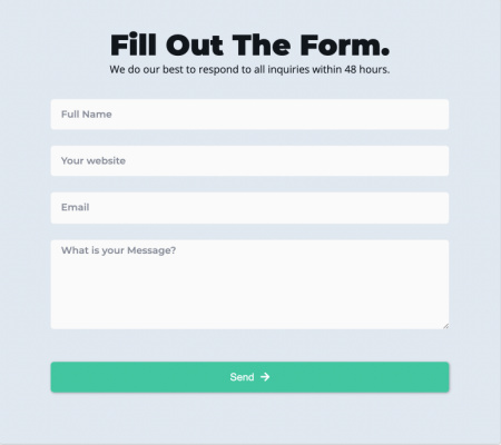
Many forms like the one above make it difficult for some website visitors to fill out because the text colour in the field doesn’t stand out from the background and there are no labels to instruct them how to fill it out.
Forms that are hard to navigate, are too big or small for the screen size, or don’t tell the user when a mistake has been made and how to fix it can lead to users leaving your website, and fast!
Have a look at the two form images below and see how a few simple changes can make a big difference in whether a form is accessible or not.
Can you tell which form is accessible?
Form #1
Form #2
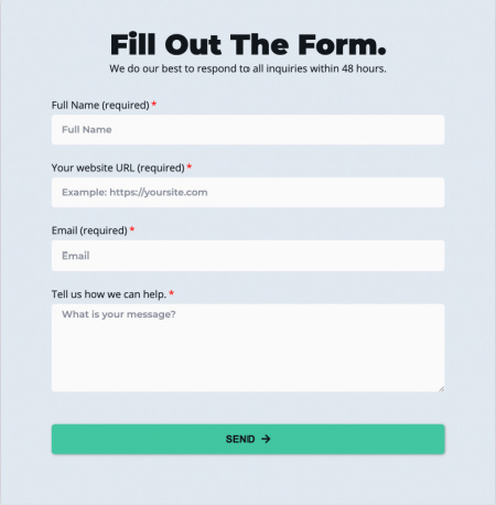
Did you guess form #2? You are correct!
Labels vs Placeholders
The placeholder text within the field in form #1 (the box with white background) cannot be read by screen readers. Although the form fields in form #2 also has the same style text, there are also labels above for screen readers and to make it more clear what is required by the user.
You’ll still see forms like form #1 a lot on the web and even simpler forms where there is only one field for an email address next to a button. The purpose of a form like this is to conserve space and fit into the overall design of a page, however, it’s a tradeoff that you as a website owner can no longer afford to make.
Form #2 does take up more space visually and may not look as clean as form #1, but that’s only because we have seen this so much it has been normalized. The above form on the right hand side takes up a little more space visually, but it is accessible in all the ways this post demonstrates and still looks great.
Make instructions visible to all users
By adding a label above each field you can be sure that not only screen readers can read out instructions to the website visitor but that the instructions will stay visible once the user starts to type in the field.
Have you ever started typing in a field and forgotten what you were supposed to type? The label above the field serves as a reminder to sighted visitors but is critical to those who use screen readers or have low vision as well.
*Required Mark
Go one step further and add a *required notation so that if the website visitor skips a field they will be notified of the error. Make sure to write the word ‘required’ next it it though as screen readers cannot read that either.
Make it Easy for Users to Correct Errors
We’ve all seen them. Forms that don’t tell us where we’ve made an error or why we can’t submit our information. It’s frustrating to have to go back and find the error yourself, sometimes losing the information you already added! Error messages need to be clear for screen readers or the user won’t know where to correct their mistake. The error recovery process must be intuitive and descriptive. If error and success messages aren’t legible it defeats the purpose altogether.
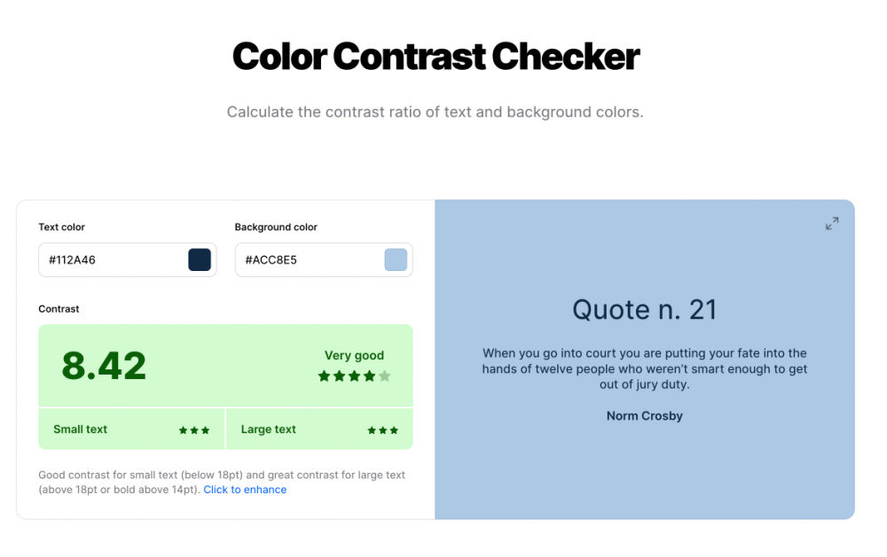
Colour Contrast
Font colours need to show up against the background in your form and in success and error messages too. Button background and font colours also need enough contrast to be effective and accessible. You can check form colour contrast at coolors.co.
Website Accessibility Is A Journey But…
Forms are one of the best ways that website visitors can contact you, download e-books, make purchases and so on. So, if your website visitors struggle filling out a form on your site, it’s bad for business.
Make sure that your website forms are compliant and your site will attract more visitors who can easily fill them out, leading to greater user satisfaction and your bottom line.
Website accessibility compliance is a journey, not a set once and done work order. Having said that, many of your website visitors can’t go down that road with you. They need website accessibility now.
I’m here to help. If you would like help with making your website forms more accessible, just set up a call and we can have a chat about it.
Until then, have a great day!
Lee-Anne