Create a great contact page
Your contact page is a really powerful part of your website, unfortunately it’s often overlooked.
At first glance, they don’t look like much, so it’s natural to assume they don’t need much thought. It couldn’t be further from the truth. It’s actually possible to convert a visitor into a customer with a well-designed and well thought out contact page.
The best way to get people to buy from you is to establish trust. Your potential customers need to know who you are, like what you and your brand stand for so they can trust you. I’m going to show you how to create a contact page that lets your customers know they’ve come to the right place.
“The best way to get people to buy from you is to know, like, and trust you. “
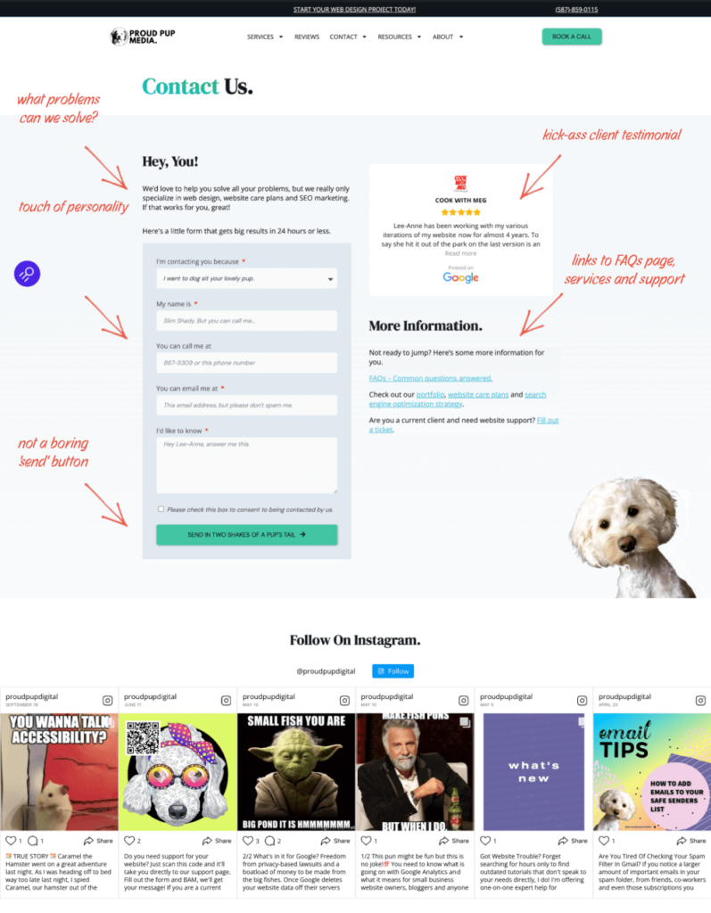
To start with, here’s our contact page for reference 💯 🐾 🤣.
————————————>>
It encapsulates all the points below and demonstrates our lighthearted approach to the work we do.
Here’s a list of things you need to consider putting on your contact page. They’re just a starting point — you can certainly add more or take away the ones that don’t make sense for your business.
9 Things that need to be on your contact page
- Your brand – Provide an example of what your brand does so website visitors and potential clients or customers understand what you offer before they get in touch. Don’t be afraid to show your personality. If you take a lighthearted approach to the work you do, make sure to demonstrate it on your contact page. Sell it!
- Email – Provide an email address for quick easy access to contact you. You can use an alias email address like “[email protected] so you know where the email came from.
- Address – There’s nothing worse than a company that’s evasive about its address. Consumers are getting wary of businesses that claim to be local but aren’t. You can build trust with your audience by showing your address. If you accept visitors to your premises, it’s very helpful for people trying to get in touch with you. If you don’t want to display your address be sure to at least include the city location.
- Map – Maps are great for customers planning to visit your office. Using Google Maps will allow your website visitors to plan their route to your business. In addition to adding reassurance, it’s visually interesting on an otherwise plain page.
- Contact Form – The contact form is a pretty standard feature on a contact page. Your visitors can easily contact you and ask for more info. It also gives visitors peace of mind that their message will go to the right place. Tell people who fill out your form what will happen when they click the send button. Use words that showcase your brand rather than the common ‘Send’ or ‘Submit’ text that is often used. Don’t be afraid to show them who you are!
- Connect FAQ Page – You can answer the most common questions that your visitors have by linking to your FAQs page. In addition to cutting down on customer service costs, you can provide faster help – especially outside of business hours.
- Social Media – If your business is on social media, it’s a good idea to include links to your pages or accounts. Visitors can use this to get in touch or learn more about your business. Your visitor might be able to get in touch faster if you’ve enabled direct messaging for your accounts.
- Solutions – Describe how your business can help solve your website visitor’s problem. This helps them decide whether contacting you is going to be worthwhile.
- Phone Number – If your business accepts phone calls, make sure this is visible. Make sure the number is set up as “tap to call”, so that a mobile user can tap the phone number and call you instantly. It looks something like this, depending on your website.
<a href=”tel:505-503-4455“></a>
BETTER CALL SAUL FUNNY NUMBER
Now that you understand how important contact pages are to your business, take action now! The contact page is most likely the most visited page on your website so you’ll want to take advantage of that as soon as possible.

We’d love to help! Drop me a line, or schedule a call and we can chat about it.
